
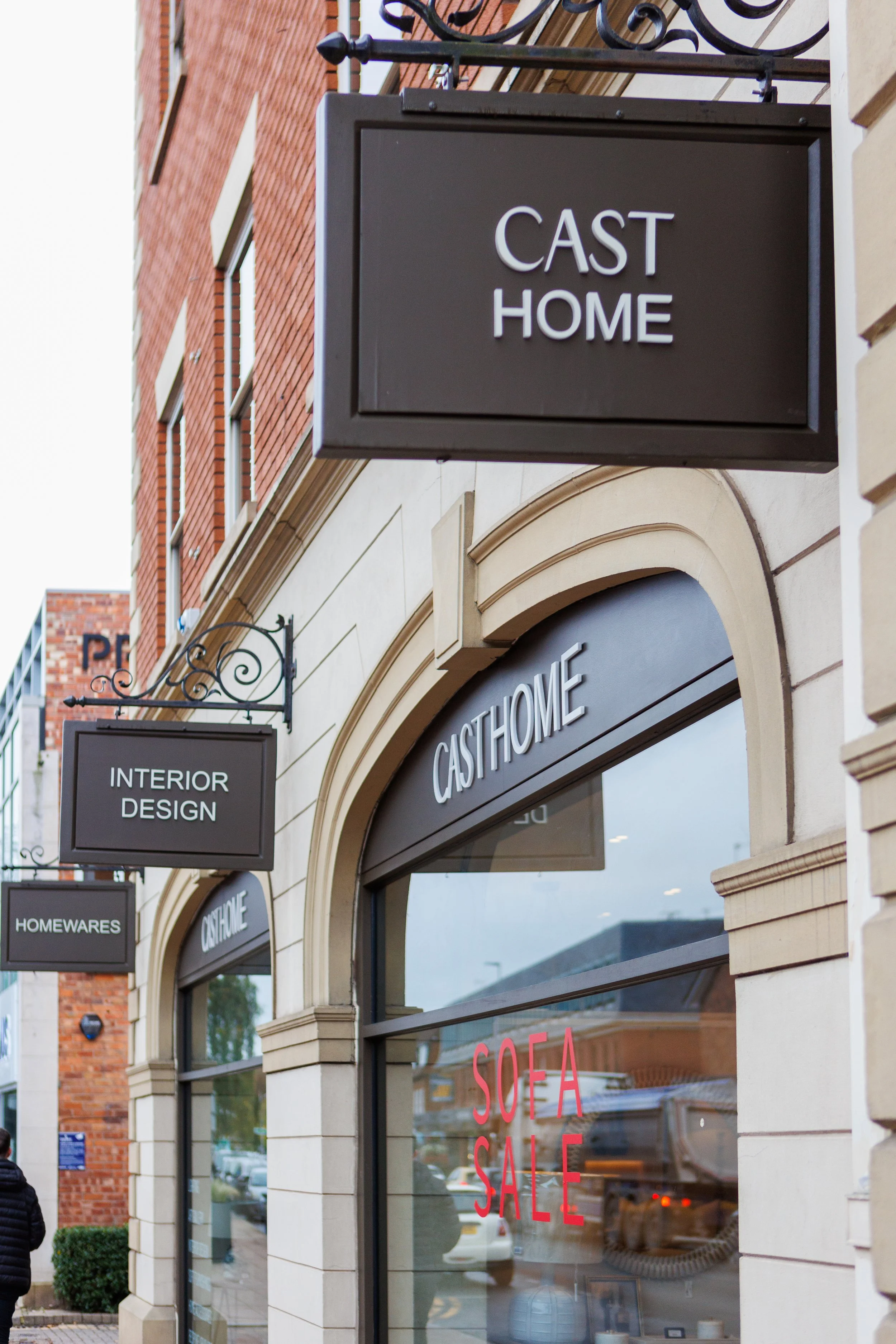
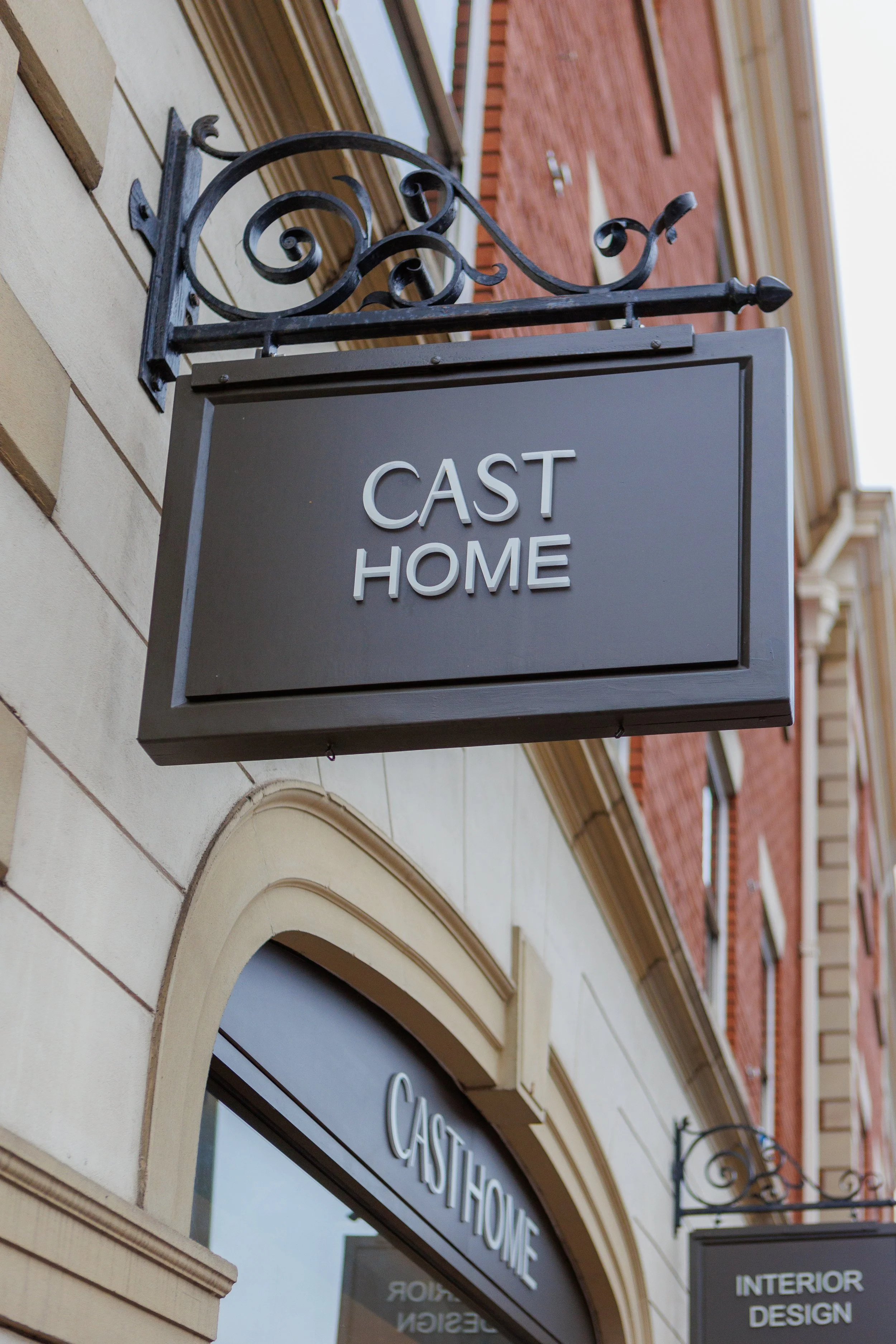
Cast Home/Interior Design
Interior Design Studio · Cheshire
A full brand transformation for a luxury homeware and interior design studio from name creation to visual identity and collateral design.
A few months later, she decided to have a complete fresh start: new name, new identity, new chapter.
That’s when CAST was born, taking CA from Carly and ST from her surname.
It felt clean, strong, and personal, a name that perfectly captured her taste for modern design, quality craftsmanship, and timeless interiors.
The Story
I first worked with Carly when the business traded as Houzlux Interiors.
After completing a rebrand under that name, Carly shared that it never truly felt hers, she had inherited it when she purchased the company.
The Vision
The new brand needed to feel calm, refined, and quietly confident.
We focused on a neutral palette, elevated typography, and simple, balanced layouts that would reflect the design sensibilities of the studio itself.

The identity was designed to work seamlessly across:
Exterior and interior signage
A-board and printed collateral
Swing tags and door mats
Digital assets and presentation materials
The Result
Seeing the CAST identity in place from the exterior signage to the finishing touches inside the showroom, was incredibly rewarding.
Every element tied back to the original intention: creating a brand that feels authentic, elegant, and truly hers.
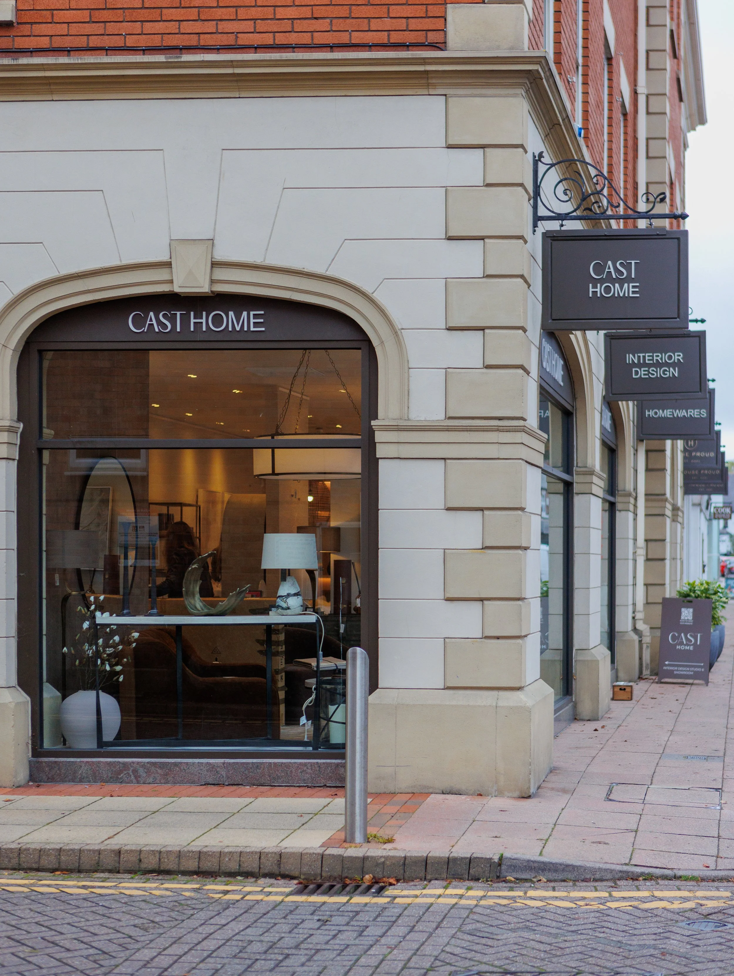

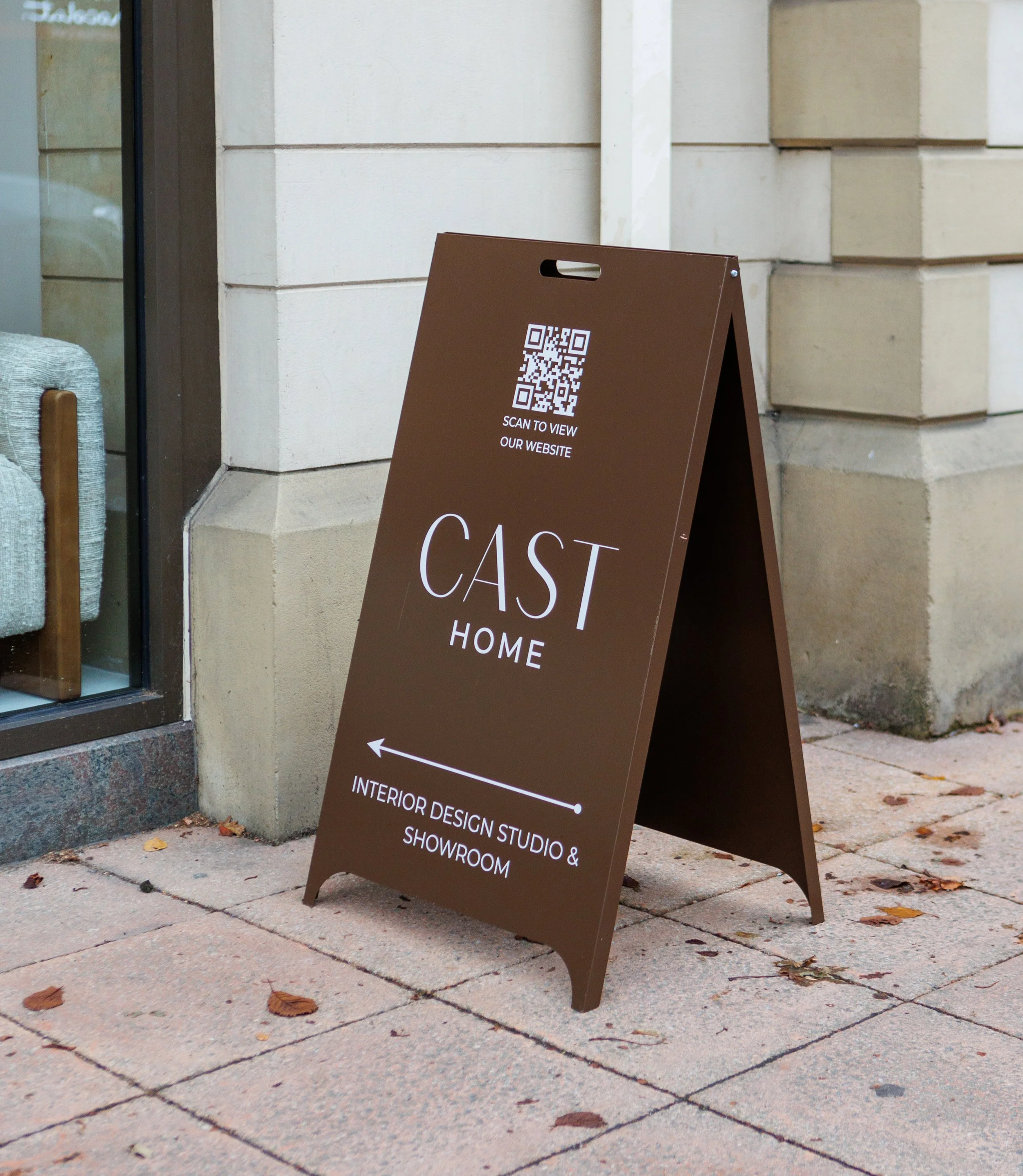

Bringing the CAST identity to life across every touchpoint from signage to in-store details.
Rebranding & Refinement
Whether you’re starting from scratch or your current visuals need a refresh, I can evolve your brand without losing its essence.
From subtle updates that modernise your logo and palette, to complete identity overhauls, we’ll help your business grow while keeping your story consistent and recognisable.
Here’s how I helped a growing local baker rediscover and redefine its brand identity.
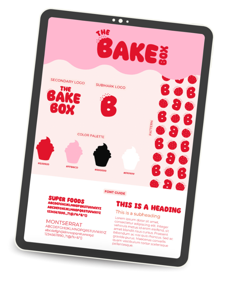


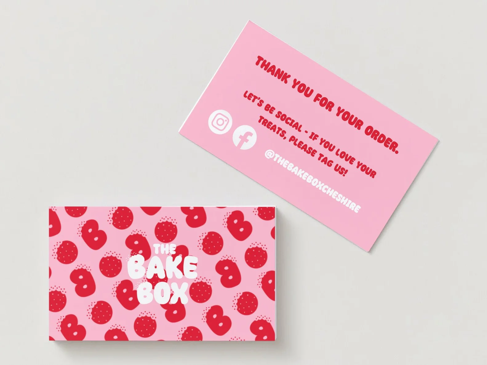
The Bake Box — Rebrand
I approached Jess with an idea that we could take The Bake Box branding to the next level. The original logo was sweet and familiar but no longer matched how much the business had grown. I wanted to create something that felt bolder, more memorable, and full of personality, something that truly captured the joy and nostalgia behind the brand.
Jess wasn’t entirely sure how to describe what she wanted, but through a mix of design exploration and intuition, I knew a retro-inspired direction was the perfect fit. The new identity takes cues from vintage bakery design…rounded, bubbly typography, playful red tones, and a wave-like layout that feels both nostalgic and fresh.
Every detail was designed to bring warmth and character while giving The Bake Box a professional, elevated feel that still feels approachable and fun. The result is a confident, cohesive brand that looks as good as the cakes taste…modern, nostalgic, and unmistakably The Bake Box.
Client Feedback:
“Gemma has completely and utterly exceeded my expectations! I knew what I wanted my business to achieve, but I wasn’t sure what my brand needed to look like. With very limited information from me, Gemma set to work and created me the brand of dreams. She has a real gift of being able to see what your business needs to look like, but it still feels so ‘me’. I am so excited to be able to re-brand, it has brought what I wanted to achieve to life. Gemma is very professional and truly lovely and I cannot recommend her highly enough!”
Jessica The Bake Box
A nostalgic rebrand full of warmth and personality giving The Bake Box a bold, confident new chapter.